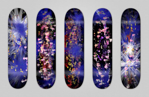
This is an interactive sketchpad that allows users to design outer space inspired graphics for skateboards.
The concept
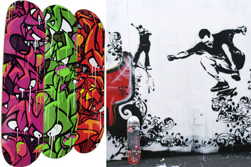
There is a strong relationship between graffiti and skateboarding, so I thought I would design a sketchpad that allowed creating graffiti imagery for skateboards.

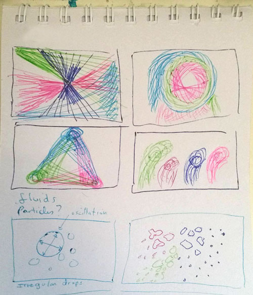
My first idea was to emulate the spray paint effect with several different shapes. I thought it could be achieved repeating shapes randomly, and sketched some directions those shapes could follow around the cursor.

What I did afterwards was to look for samples of sketches using particle effects in open processing, and found a couple I liked.
I tweaked that one to make the shapes created by particles lasting, and made other changes to control the color, size and direction.
I liked the shapes, but graffiti artists use different nozzles to achieve different effects with the paint, so I thought I’d need something else for my other brushes.
FIRST SKETCHES:
I read about mouse interaction, and used it as a basis for other brushes. I wanted the size of shapes and borders to be controlled by the speed of mouse movement so I experimented changing the values.
Then I turned the brush into a separated function, so it would only run on click.
I noticed I needed a way to change the brush so i decided to do it using keys, in this version Q and W need to be pressed for the mouse click to draw anything.
CHANGING THE CONCEPT:
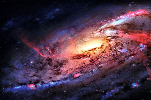
Looking at what my code could achieve so far, I thought it reminded me of stars in the night sky. So I did some visual research to see what else I could mimic from images of galaxies, planets and stars.
I especially liked the contrast between colors in this picture, so I used it as reference for my color palette.

I put my brushes together and changed colors, sizes and opacity to match planets, stars, and galaxies in outer space. The problem now was that the design looked too busy. So I added a way to darken the background by pressing a key, to tone down the back and draw new shapes over it.
ADDING FILTERS:
It still didn’t look quite right, I wondered if there was some way to allow users to edit the design as a mini version of Photoshop. That led me to processing reference where I found out about filters.
I decided to use posterize and blur, and also added yet another way to darken the background with higher opacity than the first option I made.
clicking and pressing:
Q draws big planets
W smaller planets
E far away galaxies
R blue explosion
T white explosion

C applies filter posterize

V applies filter blur
B darkens the whole canvas
N darkens the whole canvas faster

