Beebrary

A bookmarking system based on spatial memory

 Why: The brief asked to design an intuitive bookmarking experience where retrieval and organization of bookmarks was easy and memorable.

How: Beebrary is a bookmarking system for mobile and desktop that makes the retrieval of bookmarks easier by relying on spatial memory for organization.

Project Background

When: This project was developed at the User interface Class in the Master of Interaction Design and Electronic arts at USYD in 2016.

How long: thirteen weeks

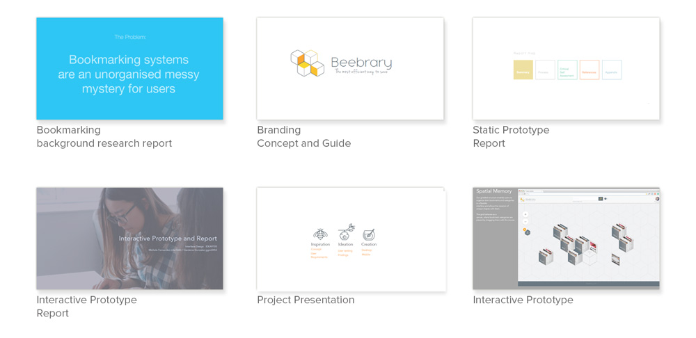
My role: I was a User Experience Designer in a team of two designers. We collaborated in all the steps of the research and UX design process, including background research, user interviews, wireframe development, user testing, iteration of wireframes,  up to the final stage when my partner worked on the UI visual design and I focused on creating the interactive prototype with CSS, HTML and JavaScript and writing.

The problem

Bookmarking systems are an unorganised messy mystery for users

TL;DR Summary

The  brief called for redesigning the bookmarking process to provide intuitive ways to re find and organize content. Beebrary set to achieve this by relying on the concept of spatial memory.

The research process led us to using the concept of spatial memory because:

  • To remember spatially where things are turns search into “active retrieval”.
  • Active recall consolidates long-term memory.

Beebrary enables active retrieval by providing a visual representation of where bookmarks are
being saved, making them memorable and easy to retrieve.

The final results were that 100% of users were able to use the interactive prototype to save a bookmark and retrieve it in less than 4 seconds. 

What were we asked to do?

AKA Goals & Success Metrics

To reimagine bookmarking applications.

  • To provide intuitive ways of re-finding and organising content
  • To understand users’ aims and help them arrive at conclusions they might not find for themselves.
  • To apply a User Centered Design Approach to the design of a new system and its user interface.

Process

  1. Research Background & user research, define UX goals
  2. Document 
  3. Collaborate and build relationships Present concept in class, process feedback
  4. Create early low fi prototypes
  5. Iterate & test user test, improve, document
  6. Create high fidelity static prototypes
  7. Iterate & test user test, improve, document, heuristic evaluation, improve, document
  8. Create interactive prototype html/css/js 
  9. Iterate & test user test, improve, document
  10. Present project 

Research

Background research

We needed to understand the current options for bookmarking available, and how users experience the process of saving, organizing and retrieving bookmarks and other data important for them.
We created accounts in Pinterest, pocket, Stumble upon, Delicious, reddit, diigo, Evernote, google, firefox and Ie explorer. Saved bookmarks in all of them and rated the experience.

We interviewed 6 users:

  • 2 postgraduate students
  • 2 small business owners
  • 2 young professionals

Background Research Outcomes

“finding a bookmark is hard without knowing the exact keywords to look for it.”
“I get tired of finding which folder is for what”
“I erase everything…it feels messy, so I start over”

  • Users don’t have enough information about what they have saved, so they start over when they feel they have lost control.
  • In all systems available finding a bookmark is hard without knowing the exact keyword or folder to look for it. Users are forced to use only the bookmarks they can remember.
  • Some existing services interfaces are good at giving a visual way to identify each bookmark. But this becomes harder as bookmarks accumulate.
  • Some services allow to search within the content of the bookmark, but most rely only on tags and titles, making hard to find one bookmark when there are many of them.
  • In real life users’ physical belongings are ordered by color, type and proximity, related objects are close to each other.

UX & Design goals 

  • Easy retrieval: it must be easy to find bookmarks and remember where they are saved.
  • Intuitive organization: must be easy to organize bookmarks, almost self organized.
  • Relieve user of effort: save more information than the one inserted by user.
  • Forgiving search system.
  • Design for multiple types of content: images, sounds, videos or text.
  • Multiple ways to highlight bookmarks: visuals, text, notes, descriptions.
  • Meaningfully group similar content

Concept

We set to create an interface that allowed the use of spatial memory into the bookmark saving process.

Why spatial memory:
To remember spatially where things are turns search into active retrieval which consolidates long-term memory. This makes for easier retrieval and intuitive organization.

“data sets…have greater cognitive impact when overlaid on a pattern that connects them in the user’s mind” (Kahn, 2009).

Low fidelity prototypes

We started by sketching wireframe prototypes that helped us to visualize how to structure our site maps for web and desktop.

Based on the initial sketches we designed a preliminary set of sitemaps 

Then we designed a low fidelity version of the wireframes and tested them with 4 users.

Iterate & test 

The wireframes were tested with 4 users who were asked to perform tasks such as saving a bookmark and creating a category. We found insights that led to the design of a second version of wireframes.

Main Insights

Users understood the purpose of the system quite quickly.

It’s actually pretty helpful I think … I always find that the bookmarks aren’t graphic enough and this is actually a pretty good way to like see what the website looks like before clicking into the link. Because it’s usually the link and you can’t tell what it is.

We needed to better differentiate the representation of a single bookmark versus a category box with several bookmarks inside.

“So it’s not a category actually, it is just a new page”(bookmark)

Users expected to be given extra options after right click (desktop) and holding down on items (mobile)

“I guess hold down over the thing I wanted to save and probably a little tab will come up”
“Right click “on the icon” to see if there is any option”

Users don’t want to dedicate too much time to naming bookmarks and expect the system to pick up data for them

“I´d be too lazy to write a name so I’d save with an abbreviation, and would be annoyed if I had to write too much”

The findings from user research led us to designing a set of high fidelity static prototypes.

High fidelity static ptototypes

Using isometrical representation of space and the concept of resemblance by mirroring objects from the real world. Portraying an element that resembles reality, users will intuitively know how to manipulate and use it, since they are already familiar with its purpose.

Browser ad on
Full page version
Mobile Interface

Heuristic Evaluation 

The two main learnings from heuristic evaluation were

  • Dialogs removed users from the hive metaphor
  • too many clicks were needed to get to bookmarks
This led us to redesigning the User Interface one more time before implementing the static prototype

Interactive html/css/js prototype 

Two interactive prototypes were implemented and tested with 4 users.
Below a walk through of the retrieval process.


The desktop version of the interactive prototype can be accessed here

Bookmark Retrieval
Full page interface
Full page interface
Bookmark retrieval
Looking inside a box (category)
Single bookmark
Bookmark Retrieval
Mobile Interface
Mobile Interface
Opening category
Single bookmark

Outcomes and results

  • 100% users understood the purpose of the platform was to save information just by looking at the interface
    “so this is…somewhere you can save your favorite websites and organize them in a very good matter.“
  • The visual interface was easily understood and two users suggested more ways to customize the boxes.
    “I would like a setting to put different colors to my boxes”
  • All tasks were accomplished smoothly and there was no guidance or help was necessary.
    100% success at accomplishing tasks

Documentation

We documented all the steps of the design process, to illustrate the journey of understanding users, the insights we got along the way and the research outcomes.

Evolution

The initial concept of a grid evolved to give users more hints about the functionality of each element.

Resembling items like categories to boxes and individual bookmarks to pieces of paper made the functionalities of the system easier to understand.

What would I have done differently

I learnt that bookmarking encompases many different goals and experiences for different users and trying to cater for all of those different needs dilutes the strengths of a product. 

Had I had this mindset earlier in the project I would have focused more effort into further improving the features that the product did best. There are many ideas that we didn’t get to explore due to time constrains that would have taken the “box” organization to a whole different level. It’s better to be the best for a specific task than average at many. 


Tools

Paper
Markers
Adobe Suite
HTML
CSS
Jquery

Methodologies

Persona Design
Low/Hi-Fi Prototyping 
Think Alouds
Task Analysis
Heuristic evaluation

Team:
Michele Fernandez
Gardenia Gonzalez